10 Excel shortcuts you must know

Microsoft Excel Training Courses

10 Excel shortcuts you must know

1. CTRL E

CTRL E makes complicated tasks easier than ever, thanks to Flash Fill. Flash Fill automatically fills data down a column based on detected patterns. Just enter how you want the data to appear, hit CTRL E, and Excel will fill the pattern down the column in a flash.

2. ALT =

Let Excel do the math for you with this shortcut! ALT = detects data in adjacent cells and automatically sums it using the SUM function. Just select an empty cell adjacent to the data that needs to be added and press ALT =.

3. ALT H O I

If you are unable to see your data, ALT H O I is here to help! Press ALT H O I to automatically adjust the column widths to fit the size of your data.

4. ALT ↓

If you are entering repetitive data in Excel, ALT ↓ is a must-know shortcut. The Alt ↓ shortcut displays a dropdown list of all values previously entered in the column. Now, you can simply select any value, which will automatically be entered into the active cell!

5. CTRL `

When cranking out formulas in Excel, checking each one individually in the formula bar can be tedious. Instead, try the CTRL ` shortcut! CTRL ` toggles between displaying the cells’ formulas and values in the active worksheet.

6. CTRL ENTER

Dragging formulas down columns and then again across rows can be a drag. Say goodbye to the fill handle and hello to CTRL ENTER! CTRL ENTER fills the active cell’s contents into selected cells. Note: The active cell has to be in editing mode for this to work.

7. CTRL T

Start getting into the routine of using Tables with CTRL T. CTRL T converts data to an Excel Table. Tables are a powerful tool that clean up formatting, auto-fill formulas down columns, automatically expand and update linked charts when new rows are added, and more!

8. ALT F1

If you are spending too much time creating charts to visualize data, meet ALT F1. These two magical keys automatically create a bar chart using the selected data and insert it right into the active worksheet!

9. ALT W VG

Are you team gridlines or no gridlines? If you’re team no gridlines, this ones for you. The ALT W VG shortcut removes all gridlines from the active worksheet.

10. CTRL SHIFT L

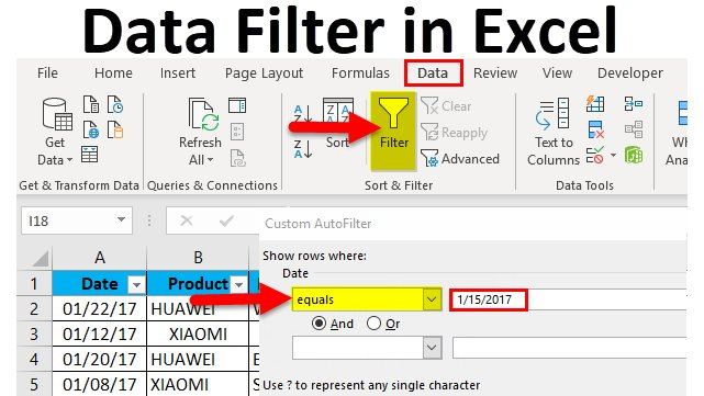
Last but not least, CTRL SHIFT L. CTRL SHIFT L makes analyzing large data sets a little easier by adding the Sort & Filter toggles to the top row of the data set, so you can quickly sort and filter data.

Like these shortcuts and want more? You can learn much more about Excel shortcuts and tricks by attending our training courses.

Microsoft Excel Data Analysis Training Course

Advanced Microsoft Excel Training Course

Business Analytics with Excel Training Course

Financial Modelling Using Excel Training Course

Advanced Statistical Analysis Using SPSS Training Course

8th Floor ZB Chambers
15 George Silundika Avenue,
Harare, Harare 263
Zimbabwe
Phone: 0719397464

10 principles of data-driven companies

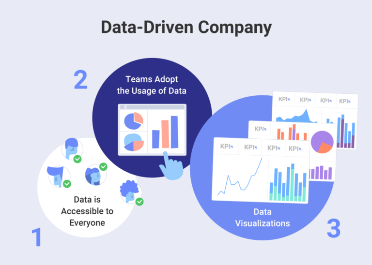
Data-driven company

10 principles of data-driven companies

10 principles of data-driven companies presented to you by Data Analysis Training Course and Advisory Services Zimbabwe. Data and analytics are essential to objective, informed decision making. With the right practices in place, companies are able to harness the power of data to provide better service to their customers, optimize their supply chains and understand the effectiveness of their marketing efforts.

Though the benefits of using the right data in just the right ways are obvious, many companies don’t have the right principles in place. The result? Up to 70% of projects don’t come to fruition.

Use these 10 guiding principles to optimize your org to be truly data driven.

1. Answer what, why and where.

Often, organizations will collect a ton of data without considering why—resulting in too much information to make sense of. Spend time at the outset figuring out what answers you’re looking for, why, and what you’ll do with those answers when you get them.

Next, figure out where the answers will come from. The monthly dashboard or spreadsheet you use to find answers is likely riddled with underlying manipulation and transformation, as data analysts manually create spreadsheets every month using data queried from a database where they’ve applied several layers of business logic, and that has been enriched with third-party information.

2. Understand data gaps and quality issues.

When gaps or quality issues are uncovered, data-driven organizations take the time to rationalize the problem. This can mean going back to your systems and enforcing more rigid requirements on data entry, or building a new system to capture the desired data. It can also mean more clearly defining the transformation and rationalization steps that need to happen with data before it becomes intelligence.

3. Define roles and ownership.

Once the components are in place to understand what to measure and why, where the information comes from, how its captured and what you need to do to it, it’s time for the who. Modern analytics strategies in particular tend to originate from the business side, meaning that IT is often forced to manage a solution they had no say in. A lack of roles and ownership results in scenarios where projects never get sign off and the infrastructure doesn’t get managed.

Once you’ve figured out the who, you’re primed to execute on your data initiatives.

4. Visualisation best-practices matter.

This is the fun part! Choosing the right display to present and explain data is critical to ensuring that the data gathered is met with understanding and utility. Start with an understanding of which chart best represents how the data should be interpreted. If you’re trying to measure a single measure comparatively, for example, consider a bar chart. A scatterplot is perfect for multiple measures and a line chart works great for time-based analysis.

A single dashboard can have more impact by tending to core design elements like layout, color, typography and size, and is how data visualization goes from “good” to “great”. Some tips:

• Don’t overuse color. It should be used purposefully with mindfulness about the absence of color to ensure the data gets seen.

• Font selection and what words get chosen as companions to the dashboard should have equal importance.

• Keeping size in mind ensures that content gets used.

• Avoid design that is over-the-top and chaotic.

5. Share stories

Stories are memorable. They inspire. They communicate the journey and reason behind analysis, and help create empathy and attachment to the outcome. Sharing data stories can become a natural template to inspire new analytics projects, and enhance overall communication and collaboration between different workgroups and silos.

One great way to get started sharing stories is to start a monthly analytics meeting. You could also send out newsletters or hijack a town hall to give a quick update on your analytics projects.

6. Leave them wanting more

Analytics done right leaves the audience wanting more. “More” can mean a lot of things—and it’s all about future initiatives or enhancements to analytics projects. Focus on these three keys:

1. Delivering more insights

Good analytics starts by answering questions and begs for more insights to be found: more     precise questions, more granular details of a subject area and gathering insights for new     subject areas.

2. Deeper questions

Instead of monitoring and measuring segregated subject areas, you should start to find     relationships among them. Deeper questions are also those that veer into the world of data     science, where the conversation shifts from “What happened?” to “What IF this happens?”

3. Enriched data

This means trying to fill in those data gaps identified earlier.

7. Focus on iteration

It can be easy to get overwhelmed by the notion that everything needs to be built and perfected on the first go. Data-driven organizations know that data analytics is iterative. That means it’s a process that can and should be repeated. Focus on starting with and connecting the business understanding, layering in the data understanding, taking time to prepare the data and associated analysis, then evaluating the results and deploying. Along this path, it’s not uncommon to go back, start over or repeat the cycle a few times before something is finalized.

8. Measure utilisation and adoption

Measurement is the key to understanding user behaviors, from consumption to creation. It’s also key to being able to plan for the delivery of the “more”, and is your first line of defense for knowing how you’ll need to scale. The three recommended subject areas to focus on are: user engagement, utilization and performance.

9. Build champions

Champions are known for their leadership and evangelism, which means they’re able to amplify the voice of analytics. They understand the mission and the goal—using data to drive decisions. They know that weaving data and facts into strategy is the competitive edge your organization needs to thrive. They’re key to promoting utilisation, adoption and awareness around analytics initiatives.

Once you’ve identified potential champions, continuously work to get them more connected to analytics projects and more involved in the strategy.

10. Celebrate victories

Data and analytics are a journey! You can learn more about how to make it a smooth one in our expert-led data analysis training sessions available on demand.

Microsoft Excel Data Analysis Training Course

Advanced Statistical Analysis Using SPSS Training Course

SPSS Data Analysis Training Course

8th Floor ZB Chambers
15 George Silundika Avenue,
Harare, Harare 263
Zimbabwe
Phone: 0719397464

Data monetisation

data analysis

One trend in data that has taken hold is monetisation. Monetising data refers to how companies can utilise their domain expertise to turn the data they own or have access to into real, tangible business value or new business opportunities. Data monetisation can refer to the act of generating measurable economic benefits from available data sources by way of analytics, or, less commonly, it may refer to the act of monetising data services. In the case of data analytics, typically these benefits appear as revenue or cost savings, but they may also include market share or corporate market value gains.

One could argue that data monetisation for increased company revenue or cost savings is simply the result of being a data-driven organisation. Though that argument isn’t totally wrong, company leaders are taking an increasing interest in the market to explore how data monetisation can drive the innovation of entirely new business models in various different business segments.

One good example of how this process can work is when telecom operators sell data on the positions of rapidly forming clusters of users (picture the conclusion of a sporting event or a concert by the latest YouTube sensation) to taxi companies. This allows taxi cars to be available proactively in the right area when a taxi will most likely be needed. This is a completely new type of business model and customer base for a traditional telecom operator, opening up new types of business and revenues based on available data.

What does a data analyst do?

Why you should use data analysis in business

Contact us

    What does a data analyst do?

    What does a data analyst do?

    Data Analysts need to know a whole lot more than just how to crunch numbers. Digging through spreadsheets and connecting the dots are crucial aspects of what a data analyst does, but you’ll also need to know how to communicate and collaborate with others to get your point across, to ensure your team comprehends what’s happening.

    What else do data analysts do all day? In this profession, you’re tasked with scouring over large amounts of raw data sets, cleaning that information so that it makes sense, then gleaning business insights and analysis, to turn that information into actionable steps to help your company.

    The information you find could help your business in various ways, like improving operational processes, allowing the company to cut back costs, or increasing ways to earn more revenue. For instance, if you were a data analyst in a sporting discipline, your main responsibilities could include using analytical techniques to uncover why certain consumer behavior is prevalent on different game days. In different industry contexts, data always has the power to help solve problems. Because of this, there are endless ways companies utilize data analysts for business needs.


    Why you should use data analysis in business

    why you should use data analysis in business

    Why you should use data analysis in business

    In most cases, the business will not realize the value which data analysis can add to their businesses. Whilst this has not been fully appreciated, the data which businesses generate and collect on a day to day basis provide opportunities for improving their service and hence business performance. It is a pity that despite having data collected on a daily basis in day to day operations, many a business do not even make the effort to utilize the data. Worse still, some do not even collect data or keep records of their operations. T start with let me give an example of how a business can utilize data to improve its performance. Of course, this is not a matter of immediate returns but in business, we need to have a long-term view.

    Let us consider company X which is in the business of supplying a seasonal item, raincoats. In 2020 they received 70 requests for quotations of which they managed to secure 15 sales. It is not important whether you consider that a good return or not but let us look ahead. If they have kept a record of all the enquiries, including contact persons, email addresses and phone numbers that means once they have their supplies ready for the next season in 2021, they have a database of 70 customers to contact directly rather than having to wait for enquiries. Moreover, they have should have done some analysis on why they did not get the order in 2020, and will now make the necessary adjustments. Maybe 20 potential clients were lost because they didn’t have PRAZ. Maybe another 10 were lost because they did not have a NOSTRO account. Maybe some were not comfortable with paying 75% as they requested. Or for some, they just did not have the right colour. An analysis of customer feedback from 2020 can help them to make the necessary adjustments and get the order this time. Knowing why they did not get the order last time will improve their chances of getting it this time. With an analysis of how they performed in 2020 and the factors which influenced performance, they can definitely get more business in 2021. For the new season, they can contact customers, making sure to inform them they have resolved the concerns that were a deal-breaker last time. Like “We now have raincoats in stock and we have now registered for PRAZ.” Of course, they will also benefit by contacting the customers who bought from them last time even before they start looking around. Some will give you the order straight away on the strength of the good service in the last year. The result should be an increase in sales from last year. That approach, repeated year after year will see the business grow.

    The issue of seasonal products does not only apply to products that are seasonal in nature. Sometimes it is your clients’ use of a product that is seasonal and that same approach of analyzing customer engagements is needed.

    Data monetisation

    What does a data analyst do?

    8th Floor ZB Chambers
    15 George Silundika Avenue,
    Harare, Harare 263
    Zimbabwe
    Phone: 0719397464